Design for an exhibition stand
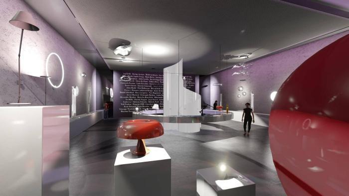
Hypothesis of a set-up for the Milan' Salone del Mobile for Artemide
AUTHOR
PROJECT: Salvatore Scarfone
RENDERING AND 3D MODELING: Salvatore Scarfone
vIDEO
Video with the rendered project
Activate the sound
Moodboards
The purpose of the project was to provide an exhibition space that reminds to the company’s products.
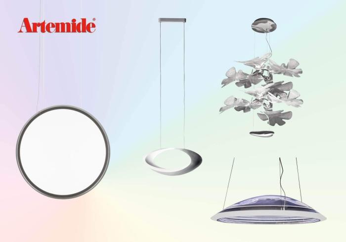
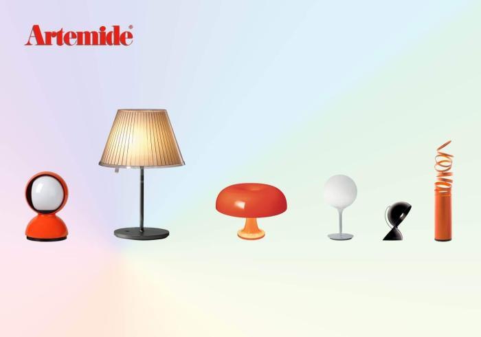
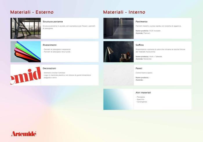
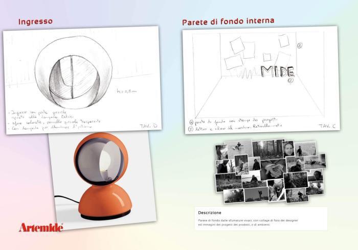
Some moodboards with the first ideas, the needed materials and products included into the project.
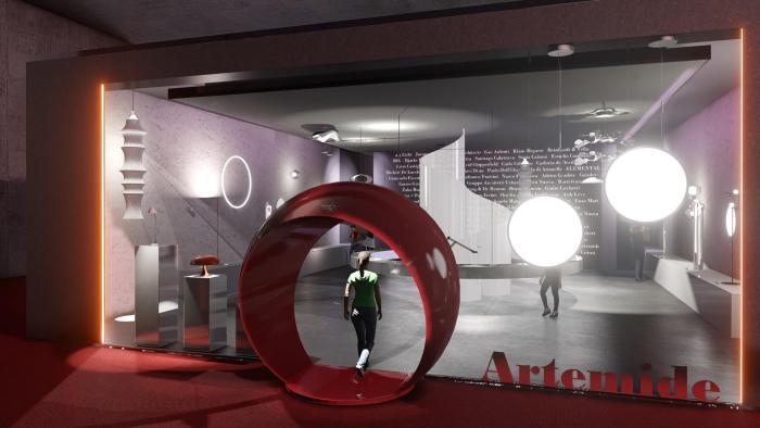
Not wanting to design a simple exhibition hall, but something that was actually linked to the company image, I designed two elements recalling the shape of their products:
Layouts
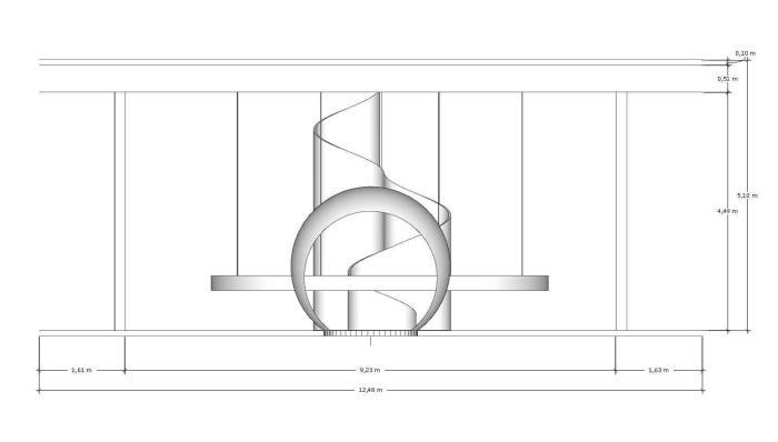
Some layouts of the project.
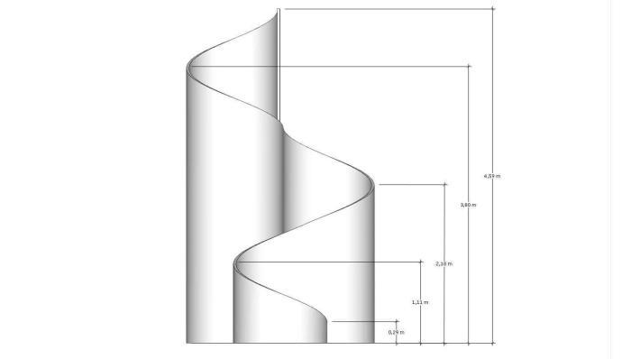
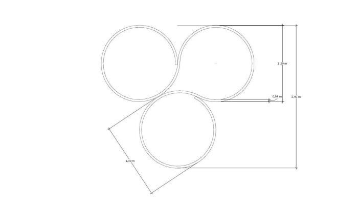
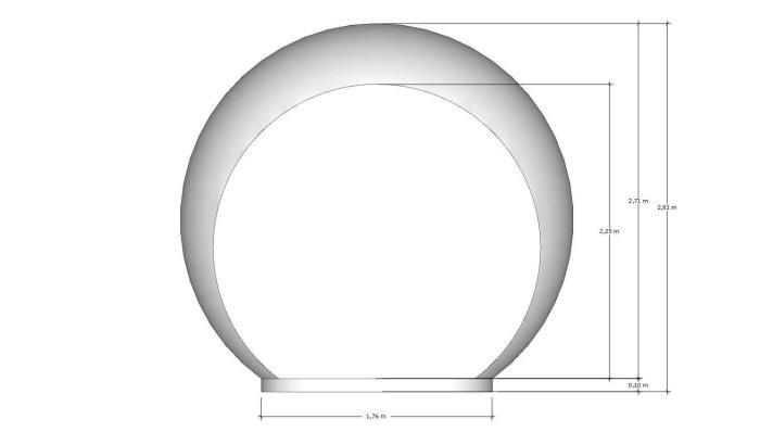
Render
La structure
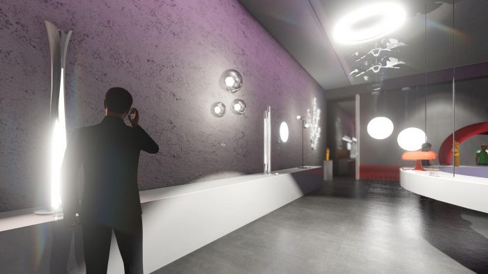
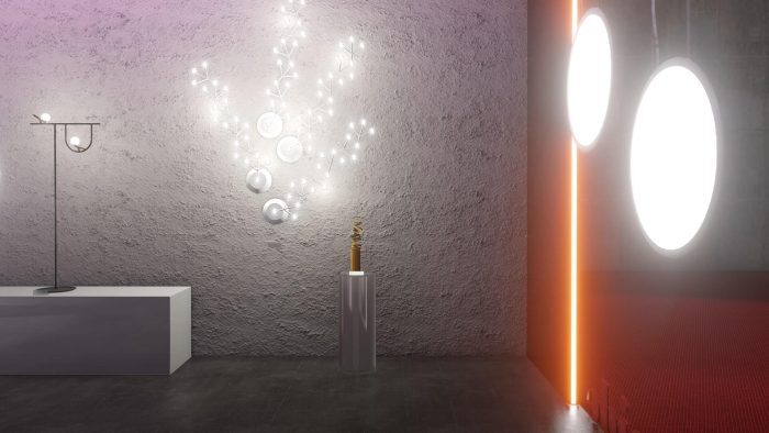
A simple style that enhances the products exposed, and which gives to the potential customer the opportunity to imagine it exposed at home. To this contributes the rough treatment of the walls, which evokes the domestic ones.
The project, with a simple and elegant appearance, is made to be suitable for both the exhibition than for the Company’s brand store.
The aesthetic choices behind the project
- Simple and elegant style that enhances the products;
- Furnishing elements that recall the shape of some products;
- Scenic effects that creates surprise (mirrors, sheet metal on the ceiling, etc.);
- The products must be exposed to form a overall scenic effect, while remaining individually.
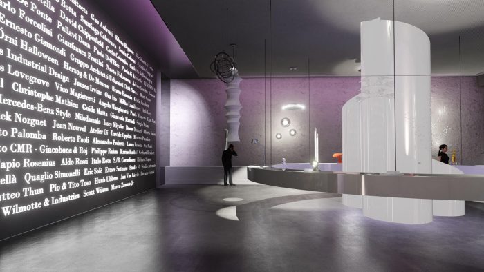
- The background wall is covered by the names of the designers who worked for the company since birth. They are positioned on a dark wall, and consist of luminous letters.
